Bright Pixel system
RoleHead of design at Bright Pixel
ResponsibilitiesCreative Director · Project management
ToolsAdobe Illustrator · Adobe Photoshop · VS Code · Git
ResourcesNetlify · Bootstrap · SASS · Jekyll · paper (yes, physical)
Sometimes in your career, you have the opportunity to create something with no constraints, just pure creativity and no hassle.
This was the case at Bright Pixel, where I had a seat at the table since day one. As creative director, one thing I always wanted to do was create and manage a brand system.
This was a passion project, though I couldn't always dedicate the proper amount of time needed because day-to-day tasks had priority. That's why I knew it should be really simple and easy to create/recreate, regardless of the final purpose (social media, invites, website, flyers...).
On this page, I laid out some of the many pieces that I created to try to illustrate how Bright Pixel presented itself.

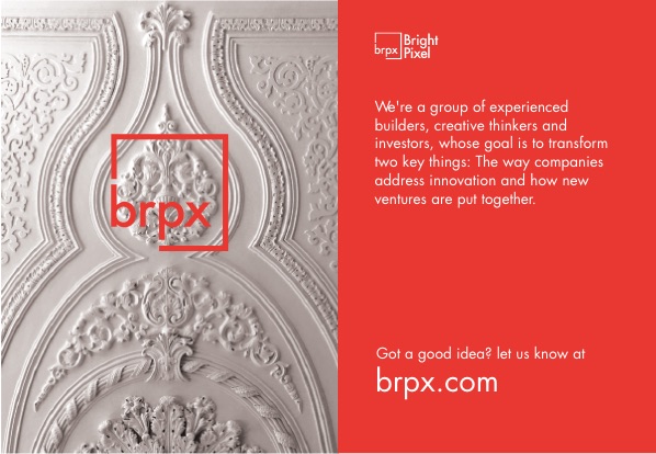
The Logo
The name sets the stage to the logo, and I wanted to be clear and straightforward.
The 3 part brand was something that worked really well, only letter + letters and graphics + just graphics.

Typography
Futura was a simple choice, both for what it represents and for the design. Adding a "square" to illustrate the pixel in the name provided the base. Then it was just finding the balance between all the parts.
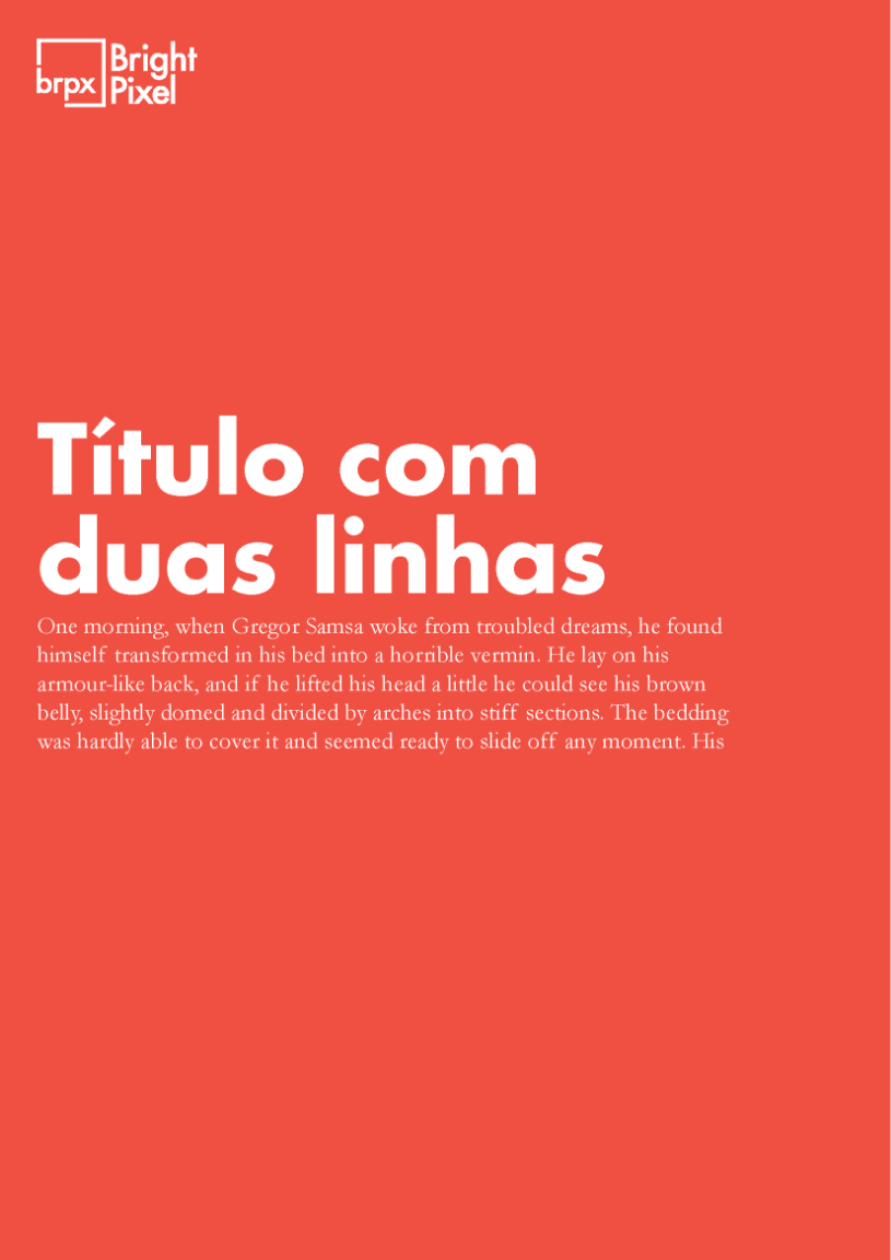

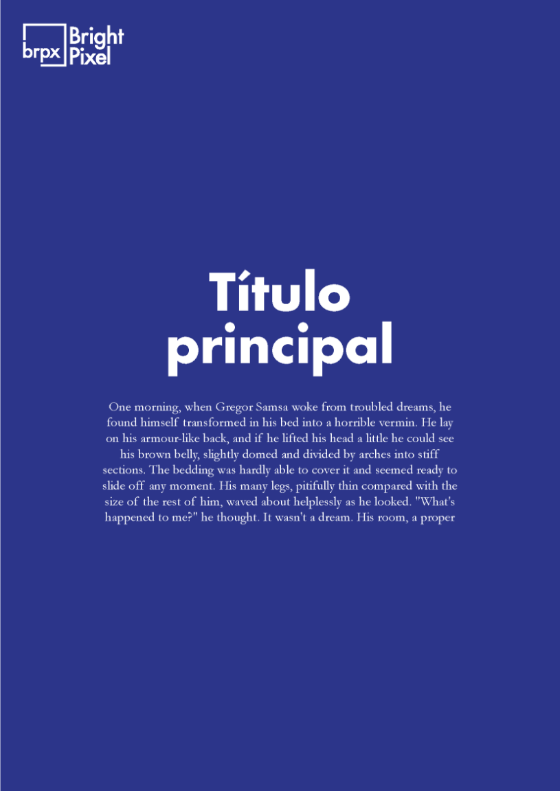
Colors
The whole system was based on 5 colors - intense colors that defined almost all communication along with black & white applications.
Red was chosen as the main color because it contrasted well with our beautiful HQ in downtown Lisbon, creating an interesting backdrop for the high-tech products and services we developed.
Later on, I started to incorporate the other colors and mixed them in long, two or three-color gradients.


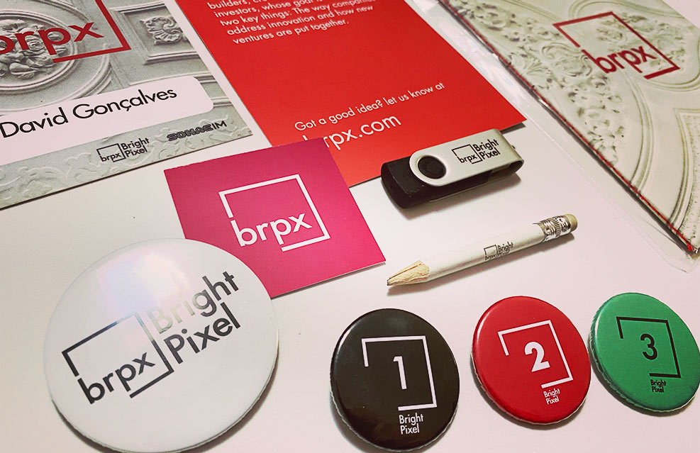
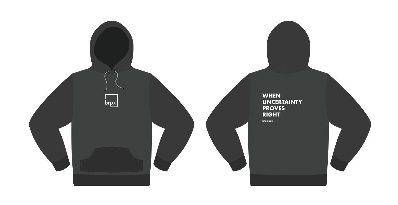
All companies end up producing a lot of merchandise, we did the same and always was a mix of color/B&W, text, and photos.
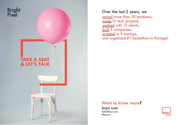
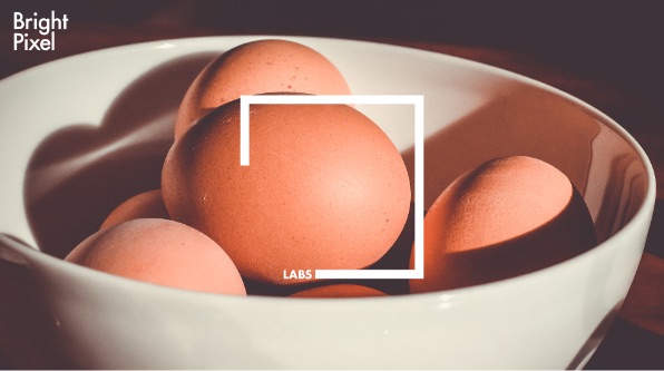
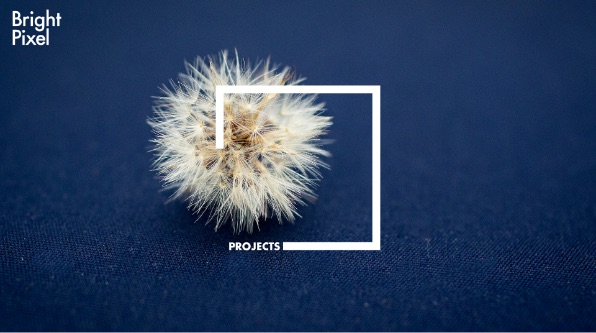
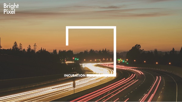
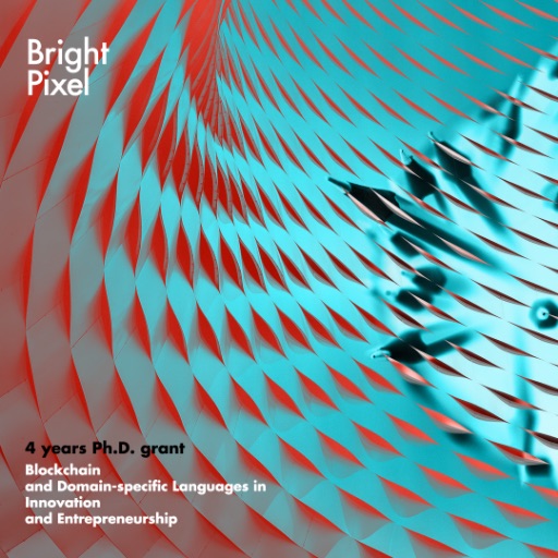
Images
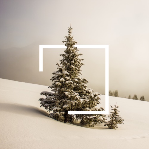
The use of images was always something that I used to create an extra layer of texture and depth.
Whether they were abstract or actual photos taken of the main subject of the message, they played a massive part in the Bright Pixel system.

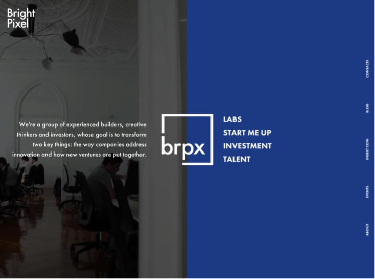
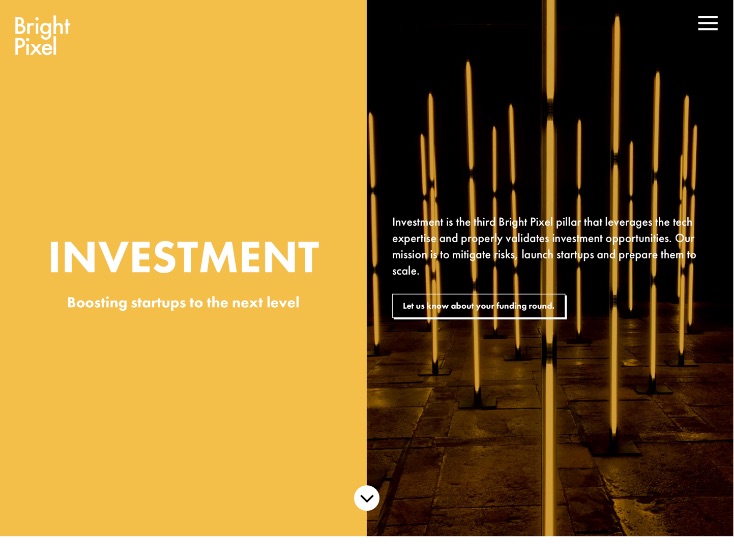
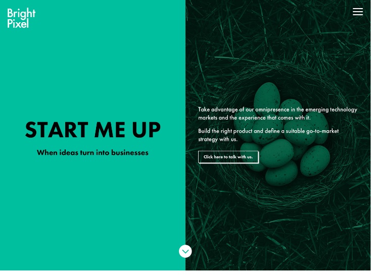
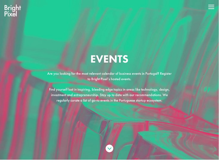
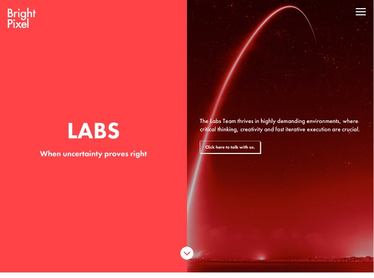
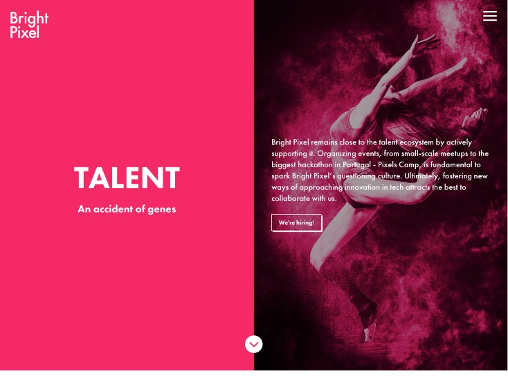
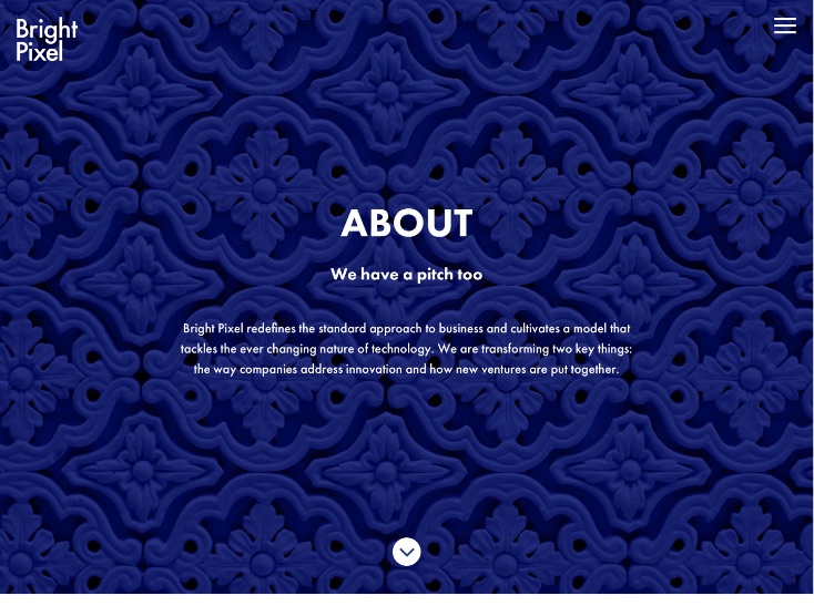
Website
The brpx.com was a great playground, probably the company website where I had the most freedom to convey a challenging message that explained what Bright Pixel is.
We've divided the communication into 4 different pillars: Labs, start-up, investment, and Talent. I used one color for each every time and maintained a lot of core elements that conveyed the Bright Pixel universe.
The website has been redesigned, but the one that was live from 2017 > 2020 is the one that I want to leave the reference here.
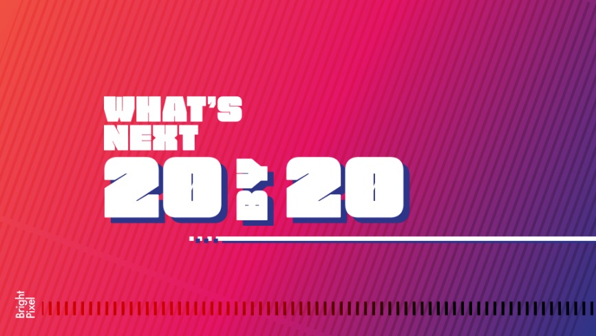
Sub sites
At Bright Pixel, we created many small websites for projects or sub-brands under particular topics.
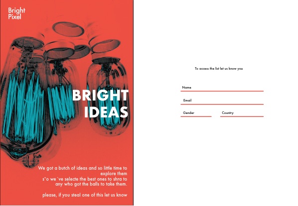
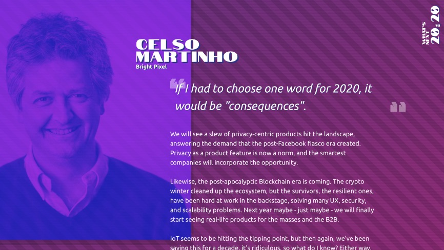
At the end of 2019, we created one where we asked for 2020 trends. Little did we know what was going to happen in 2020, but I wanted to leave this visual reference as something that I think worked really well and demonstrated the full potential of the brand.

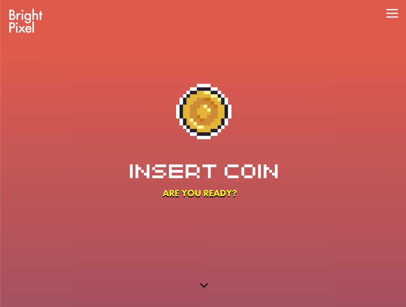
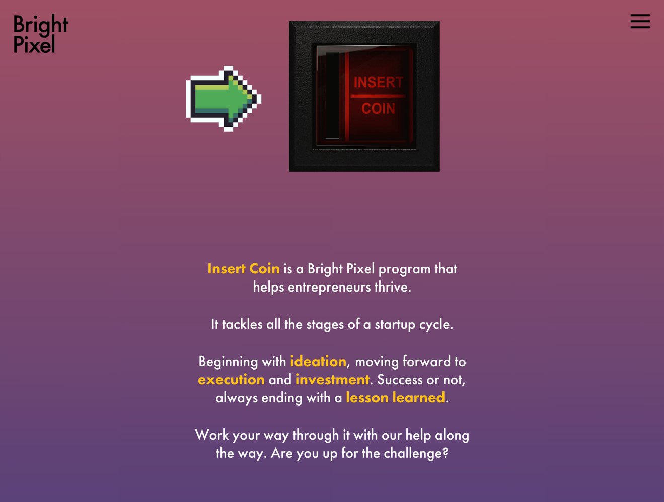
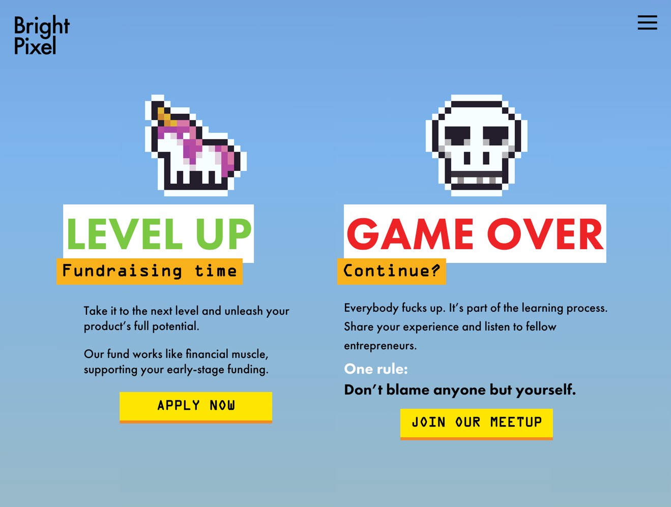
Another example was a program called "insert coin" that aimed to attract good ideas and good entrepreneurs that might fit the Bright Pixel investment verticals and had a presence in events, websites, and even a series of interviews. My role was to make a sub-brand that stood out, but they felt like it was part of the Bright Pixel system.
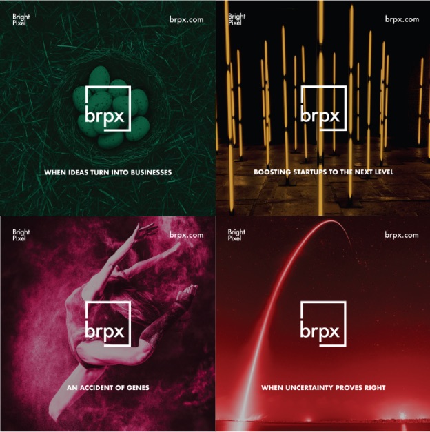
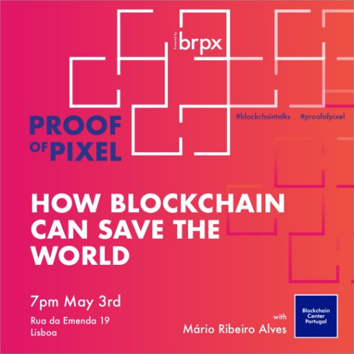
Social Media
In today's world, a brand has to navigate the social media waters to survive and make a statement.
I've worked the different platforms under the same brand system, and the goal was to make the users identify a Bright Pixel post immediately out of the social feed.
Here are four examples of the posts made on Instagram.

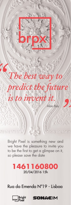
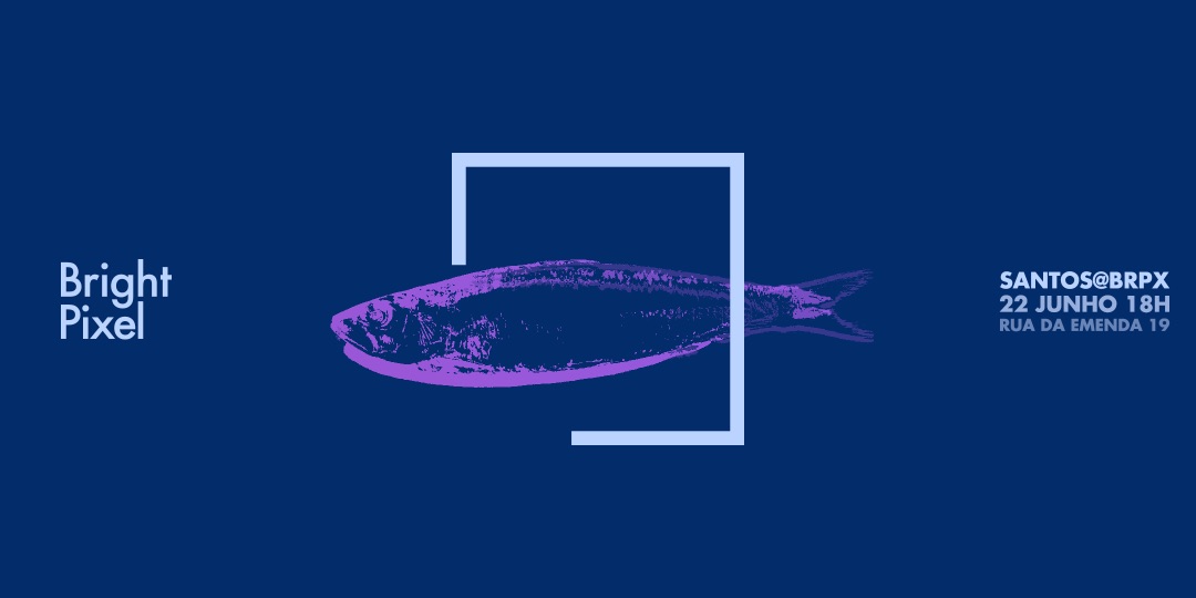
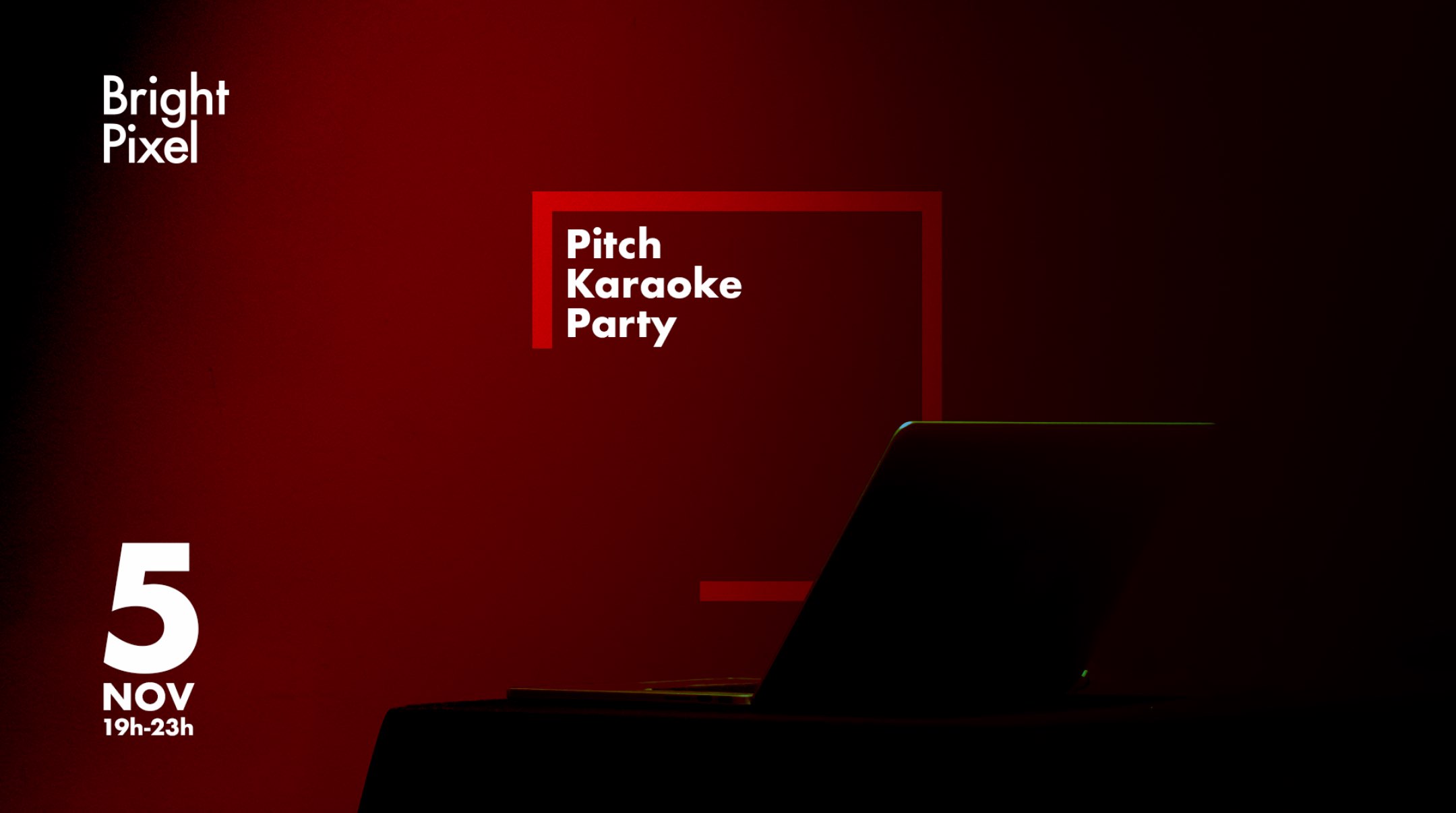
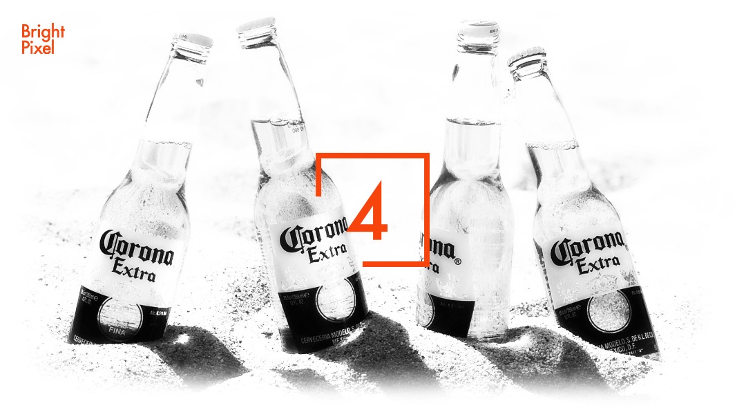
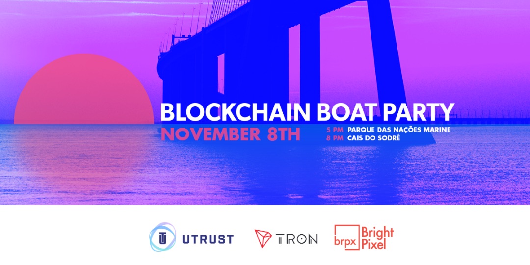
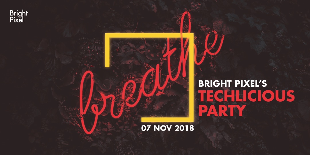
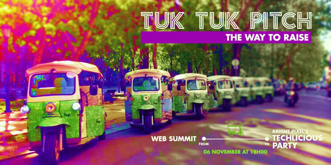
Invitations
To finish this page, I wanted to show the Bright Pixel brand system's application in event invitations. This was an area where I pushed the visuals further, ensuring each piece could stand on its own while remaining part of the whole system.