MEO cloud
RoleLead Designer at Sapo
ResponsibilitiesLead Designer · UX Designer
ToolsAdobe Illustrator · Adobe Photoshop · Sketch · Git
ResourcesDjango CMS · Bootstrap
MEO Cloud was a virtual drive, a Dropbox-like competitor for the local market.
It had similar functionalities to other virtual drives (Dropbox, OneDrive, Google Drive, etc.) with local sync for macOS, Windows, and Linux. Mobile clients were available for iOS, Android, and Windows Mobile. The unique feature of MEO Cloud was its IPTV app.
As the lead designer from the beginning, I was responsible for all user-facing aspects including experience, functionality, and visuals.
The experience
When I started on this project, I was finishing another service for the MEO broadcast brand. It was part of a suite of services designed to add value to the basic TV + internet subscription.
For us, at SAPO, it was the natural way to create a product. We saw the trend, we believe we could do it, and we got the resources to do it. The Team was one of the best I've ever worked with, only with them could be possible to build this.
My role at the start was research, a lot of it. Most of us use these services but have no idea how hard it is to deal with people's files and small things that happen.
The other challenge was communicating how this service works to a much broader audience that may not have extensive digital skills. This service received primetime attention at the time.
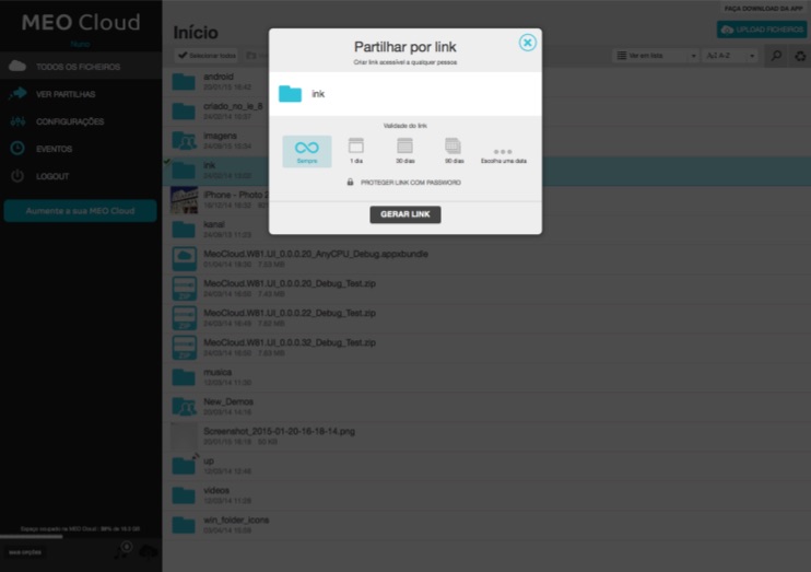
The result was excellent - we created a service as good as or better than Dropbox, with features that no one had at the time, such as password protection for shared links, folder upload capabilities, and a TV client.
When I left SAPO, we had more than 1M new files daily, 365K users, and more than 635TB of space. Please have in mind that the MEO Cloud was launched only in Portugal, and we have a population of 10M.
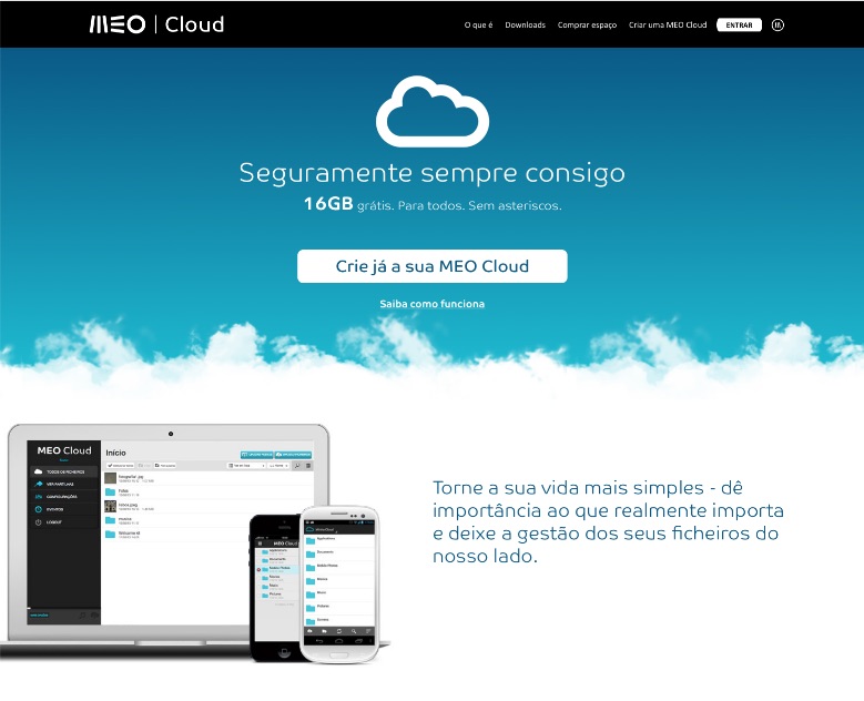
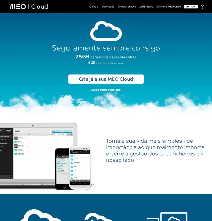
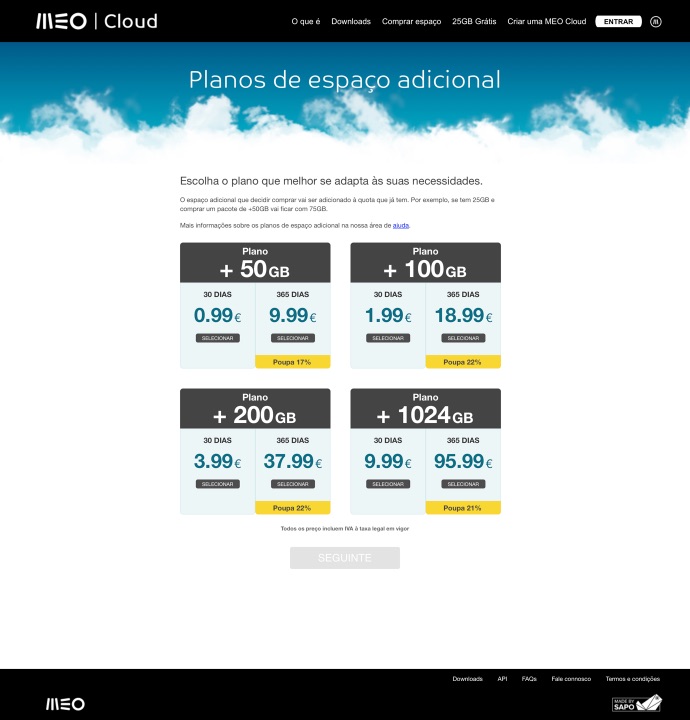
Website
The website received less of my attention, which is why it maintained a straightforward approach.
The blue gradient with a "cloud" transition to white background became our template.
The primary communication was made in the meo.pt commercial site, and my focus was on the product itself.
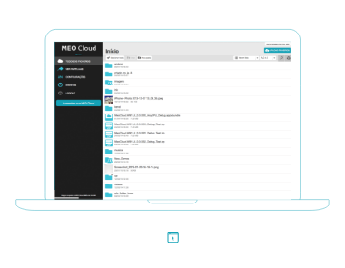
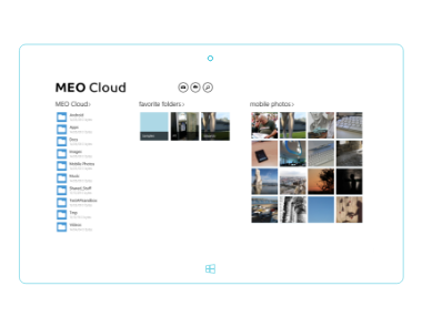
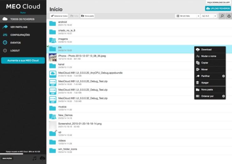
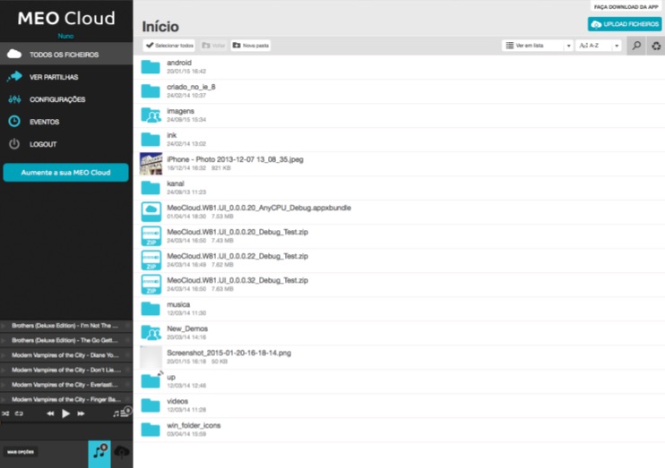
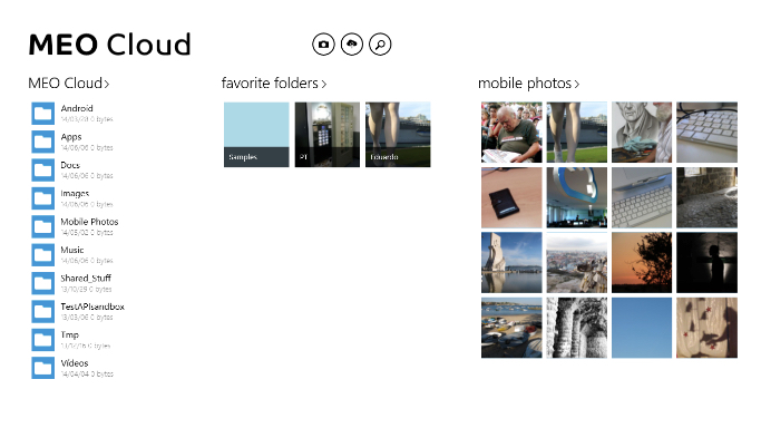
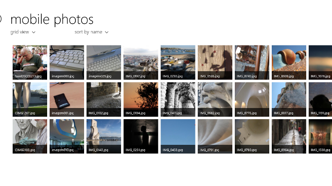
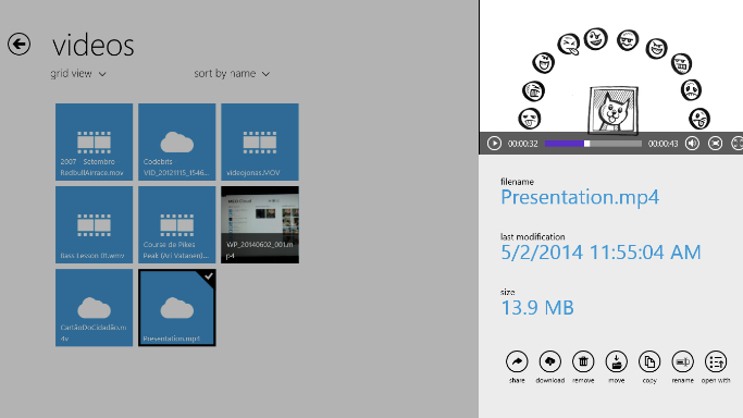
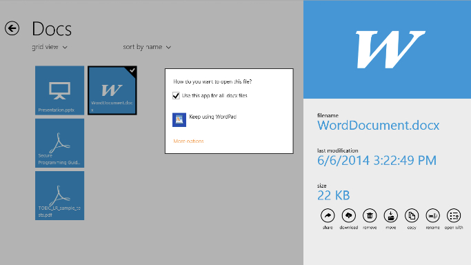
Web App
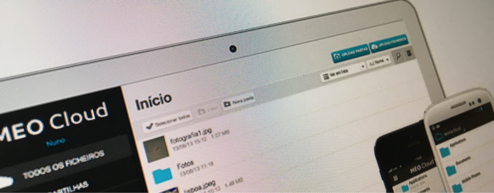
The web app was the asset that I spend more time on the whole project. The style guide that influenced all the other apps was made for the web app, back in 2012. Now it's a bit outdated, but it made perfect sense at the time.
The black background in the navigation, the white background on the file list, and the icons on light blue would set the base color scheme.
I coded the HTML and CSS for the web app and was my first project mobile-first. Full responsive was something that most web products did not have in 2012.
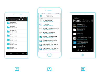
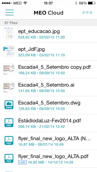
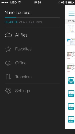
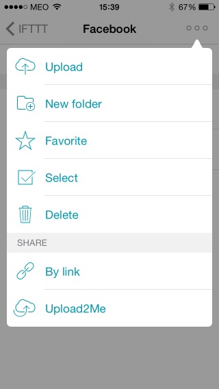
iOS
This app received a redesign by Hugo França under my creative direction.
Being the most recent update (2014), it features a more refined overall look & feel.
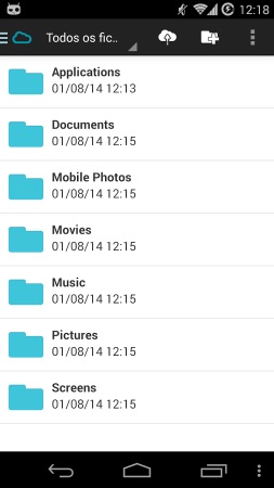
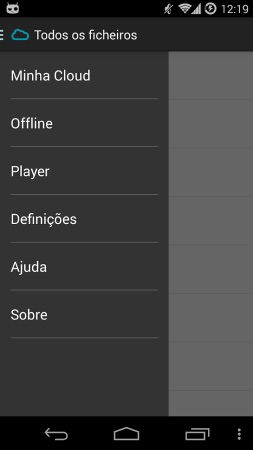
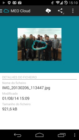
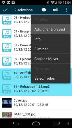
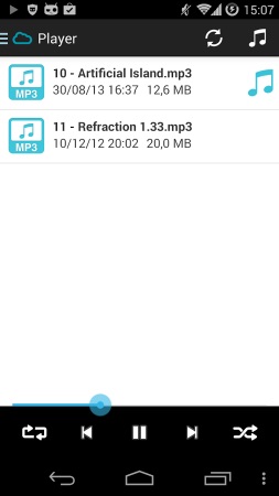
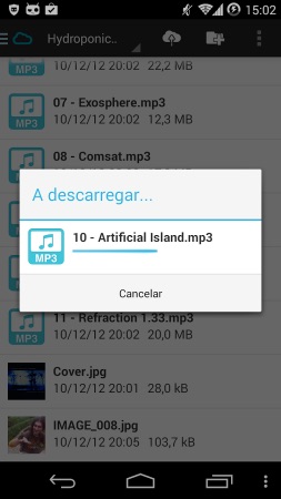
Android
For Android, I chose to follow native design patterns as much as possible while applying some MEO Cloud styling to the icons and colors.
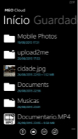
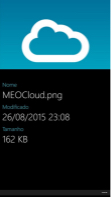
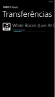
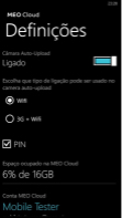
Windows Mobile
For Windows Mobile, I used the same principle as Android, keeping it pure and respecting the OS best practices for UX/UI.
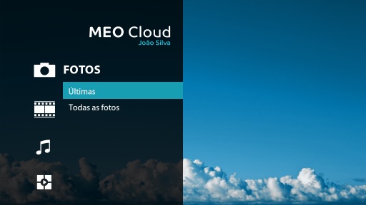
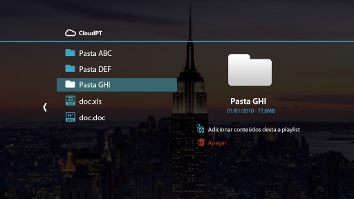
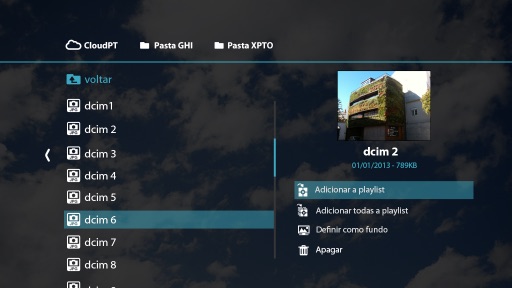
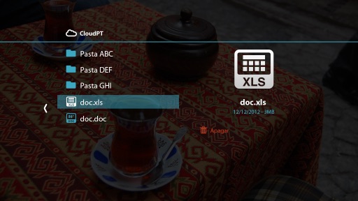
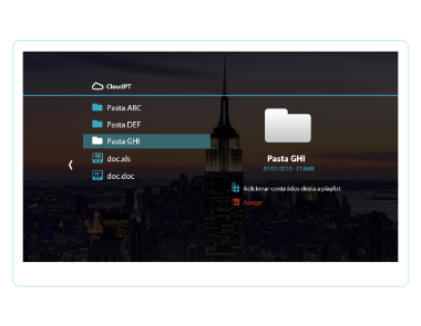
IPTV
IPTV was a good challenge. We had to make something because of the MEO IPTV ecosystem.
The main focus was images, music, and videos, using a big screen and a remote to navigate doesn't leave much more functionalities. We made a lot of text interfaces and simulated different navigation options and to be fair. It was a lot of fun to have the opportunity to design this application.