Público Mobile Applications
RoleHead of design at Bright Pixel
ResponsibilitiesVisual Design · UX Design · Research · Specification · High Fidelity Mockups · Project Management
ToolsAdobe Illustrator · Adobe XD · Zeplin · Git · ProtoPie
ResourcesReact Native · Bootstrap · SASS · Jquery
Screencast of the production iPhone app
While at Bright Pixel I worked closely with Público, one of the major newspapers in Portugal to develop a new version of the newspaper's mobile app for iOS and Android.
On this page, I will try to describe the process behind the challenge: re-think and redesign a news mobile application that could have a significant impact on the business and user experience.
Download the applications here
Concept
Working with a prominent newspaper like Público, it requires balancing between commercial and editorial interests. Both sides are key decision-makers in the process.
When I lead a project and work closely with the product owners, I like to start with brainstorming sessions, sometimes close to design sprints, to try to get everyone in the same level field.
In this case, it took me a couple of visual concepts to try to set the application's mood/style/voice.
We knew that this, with a clear goal from both sides of the decision, would kickstart all the work.
Wireframes
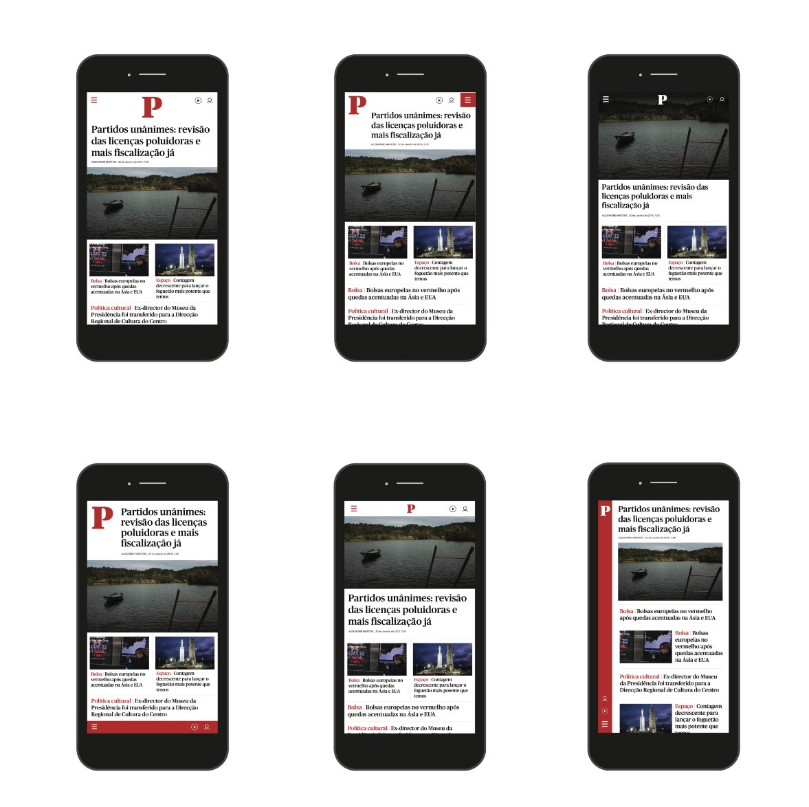
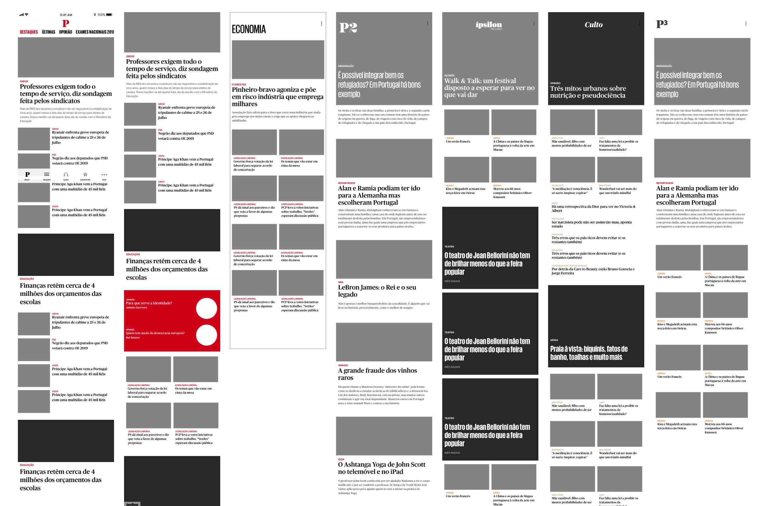
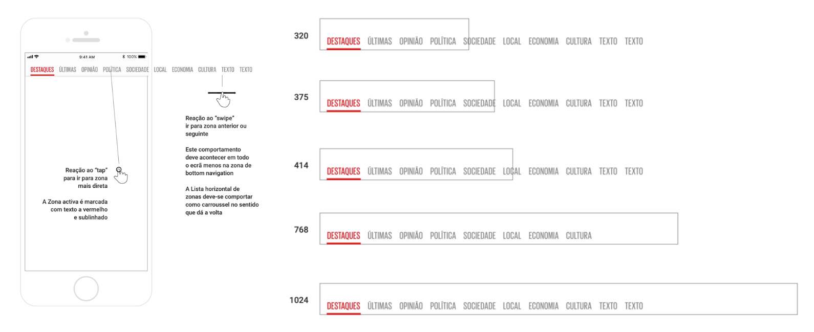
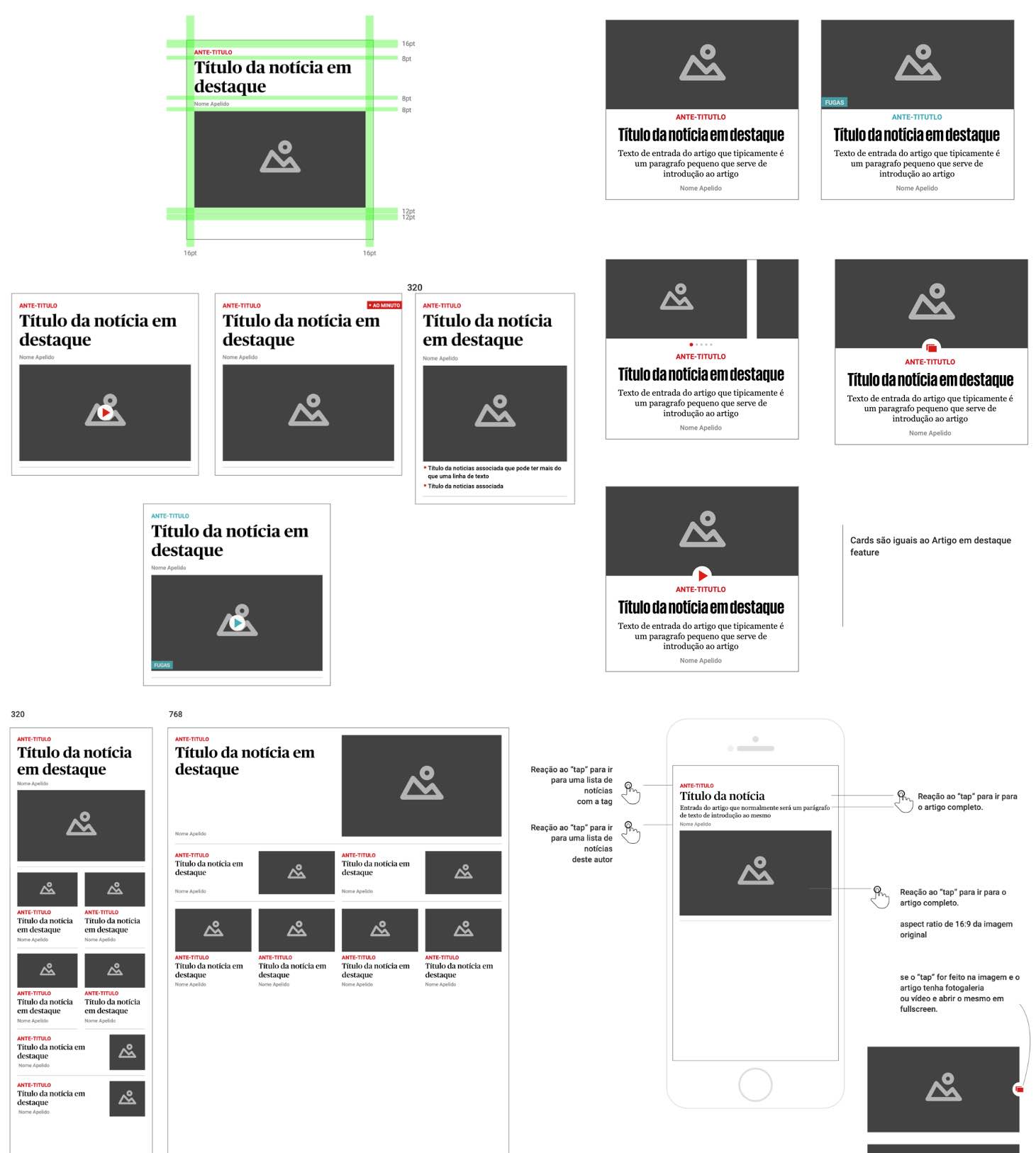
The wireframes in this project were particularly relevant to establish the complexity of screens and variations of news cards in the application.
After working close to the internal team that created the API that serves the website, I had to build a system that would mirror the same approach to mobile applications.
At the end of this phase, we experimented with animations to demonstrate how navigation would feel in the application.
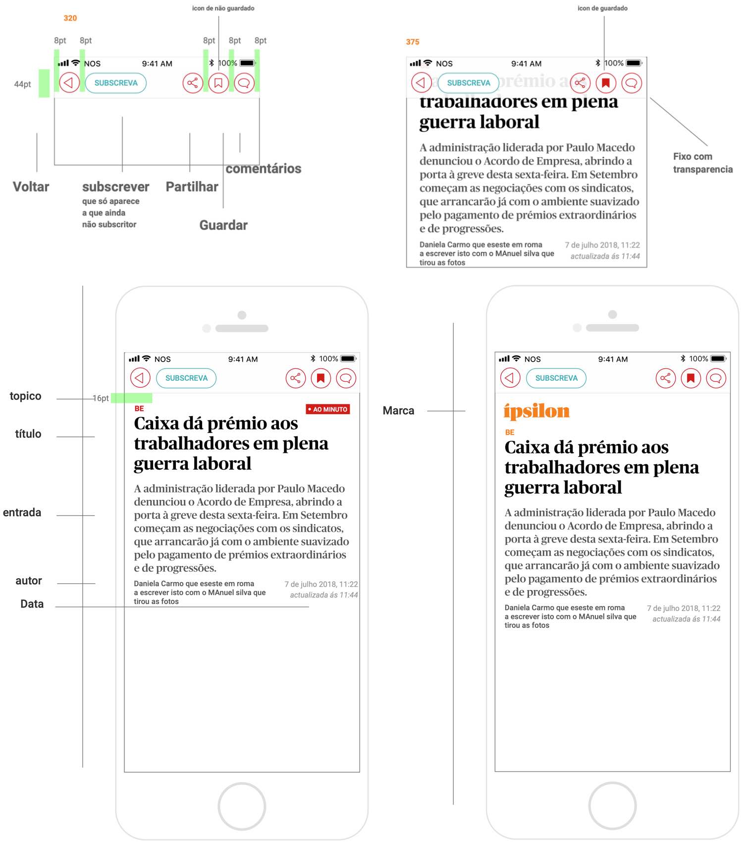
Specifications
Handing off the work to the development team presented another challenge. We had a very tight timeline with budget constraints that could potentially risk the entire project.
I used Zeplin to create a direct line with the development team for asset inspection and download. However, this project needed more. I created a visual cookbook, structured like seasons of a series, to provide clear visual documentation for all stakeholders, including non-technical team members.
It worked pretty well. We had to have an approved PDF at the start of every sprint.
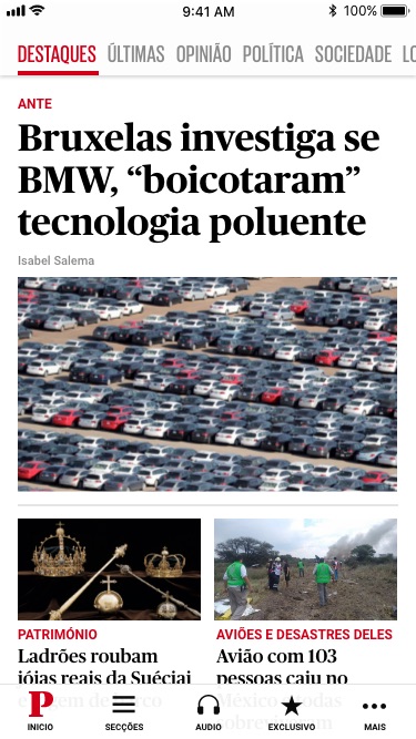
Final application
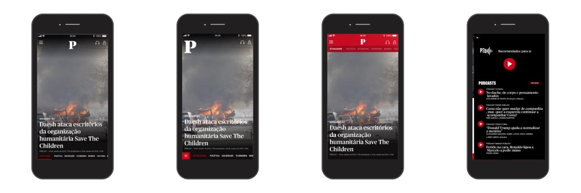
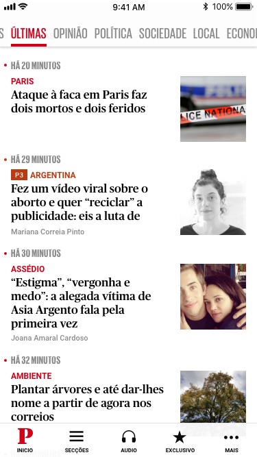
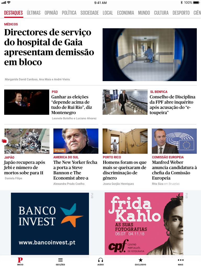
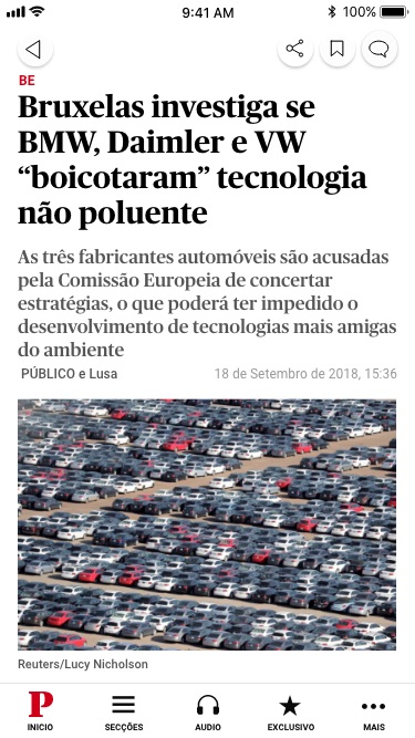
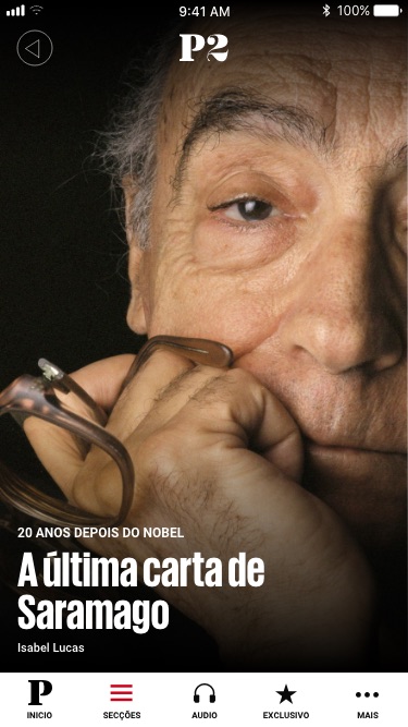
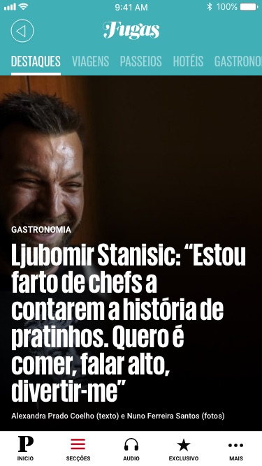
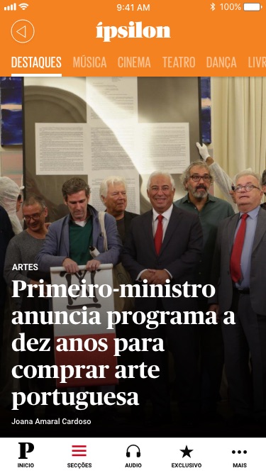
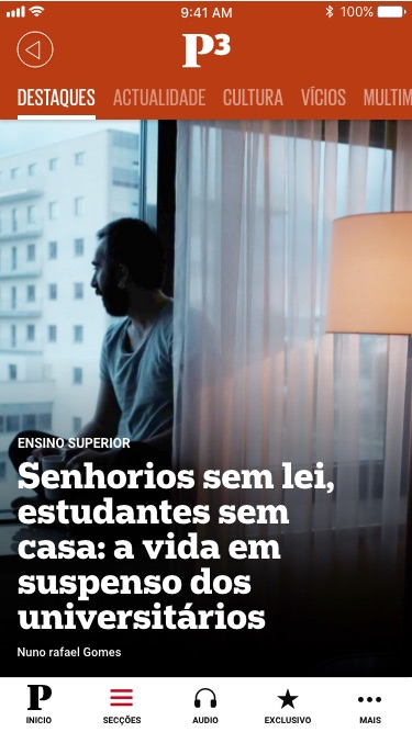
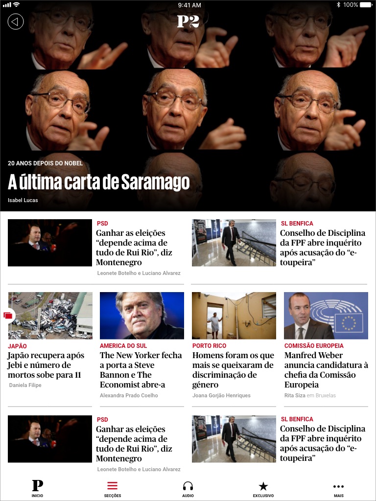
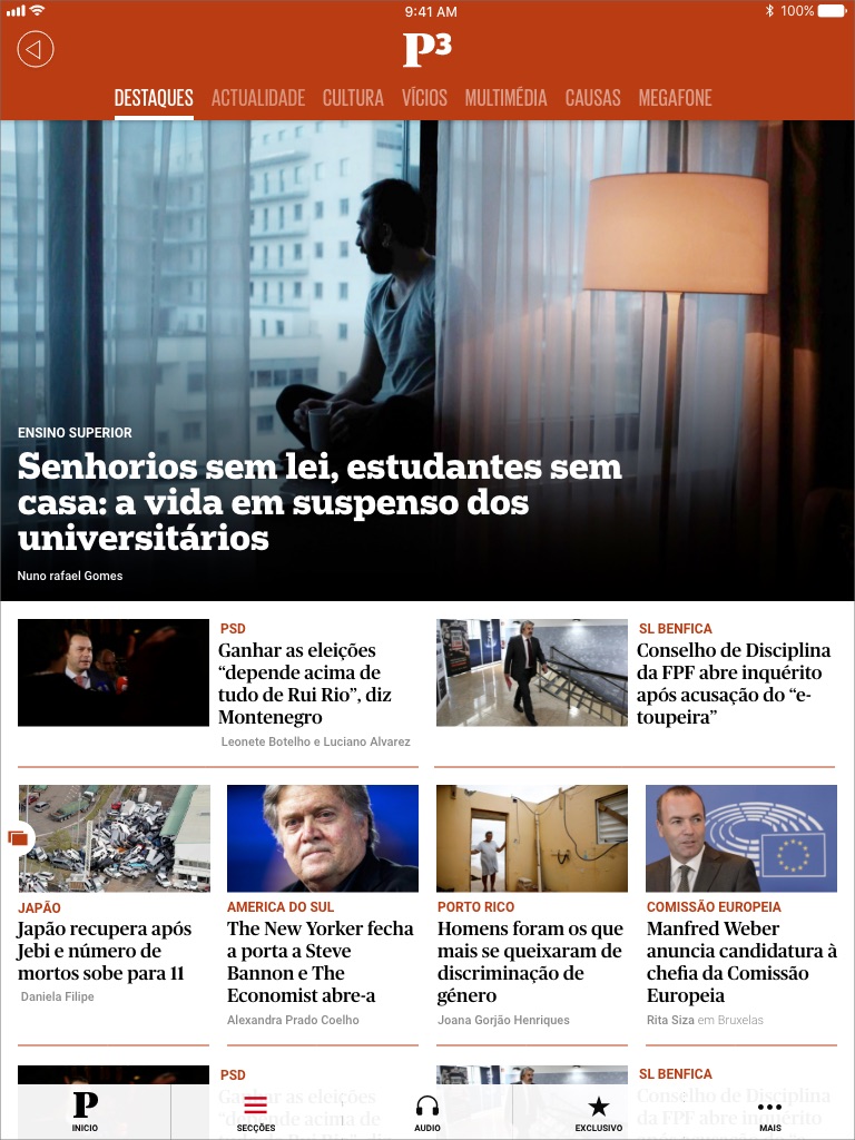
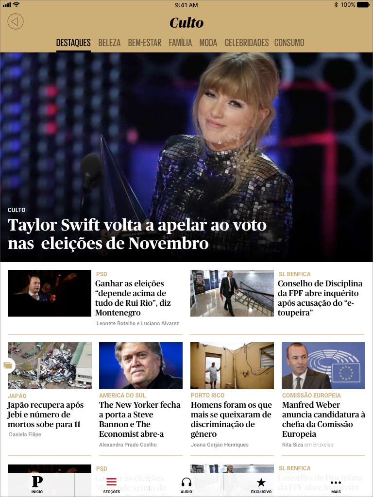
The print version's aesthetic inspired the final application design. I incorporated grey lines to divide cards, removed shadows, and replicated the symmetrical relationship between titles and text. The color scheme and dynamics were consistently applied across all Público sub-brands.
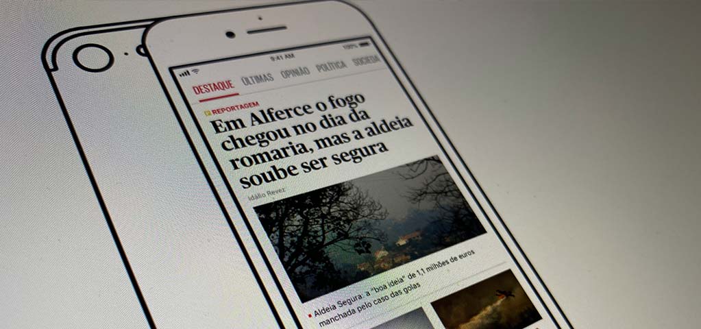
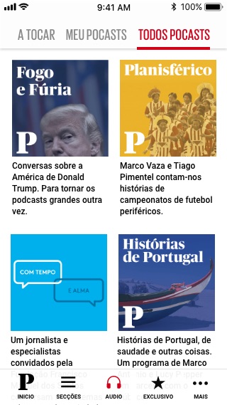
We created an experience that brings the latest news with a feed always changing mixed with a more long-form call to read. We also brought a lot more attention to the podcast section and the subscriber's area, which would push the subscriptions.
Main news feed
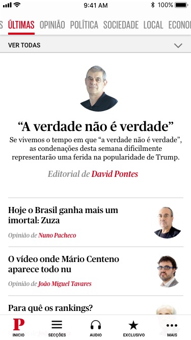
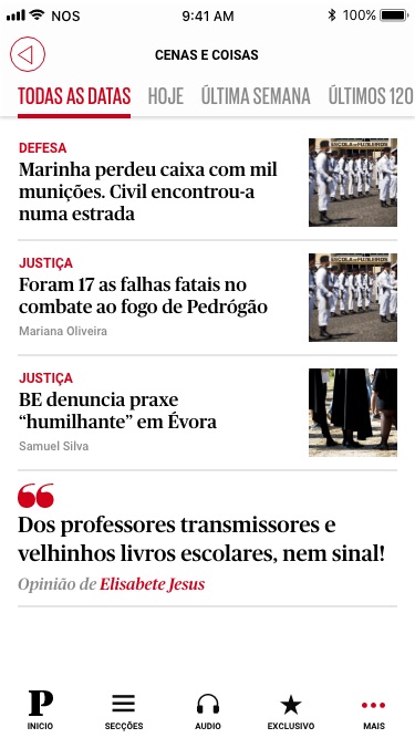
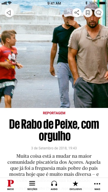
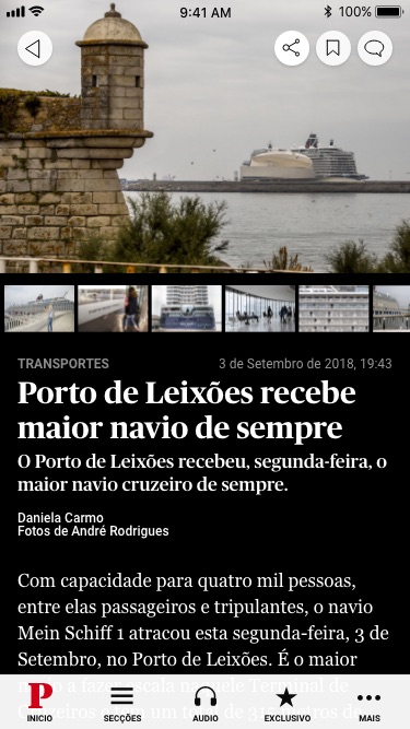
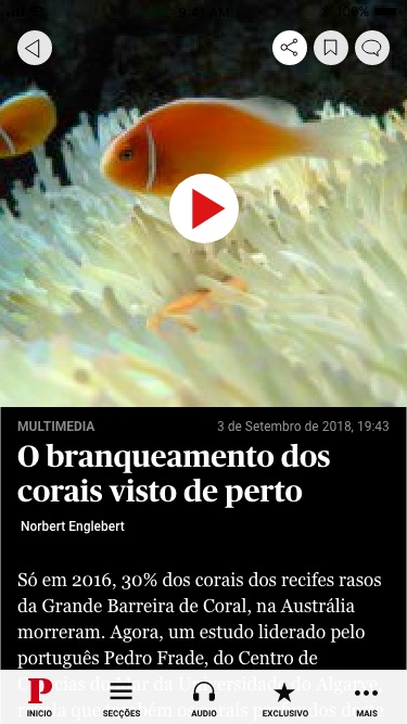
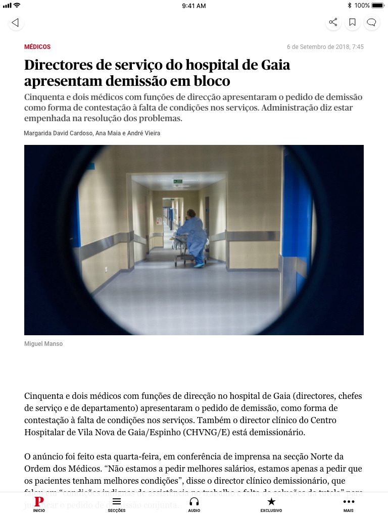
Article screens

Branded sections
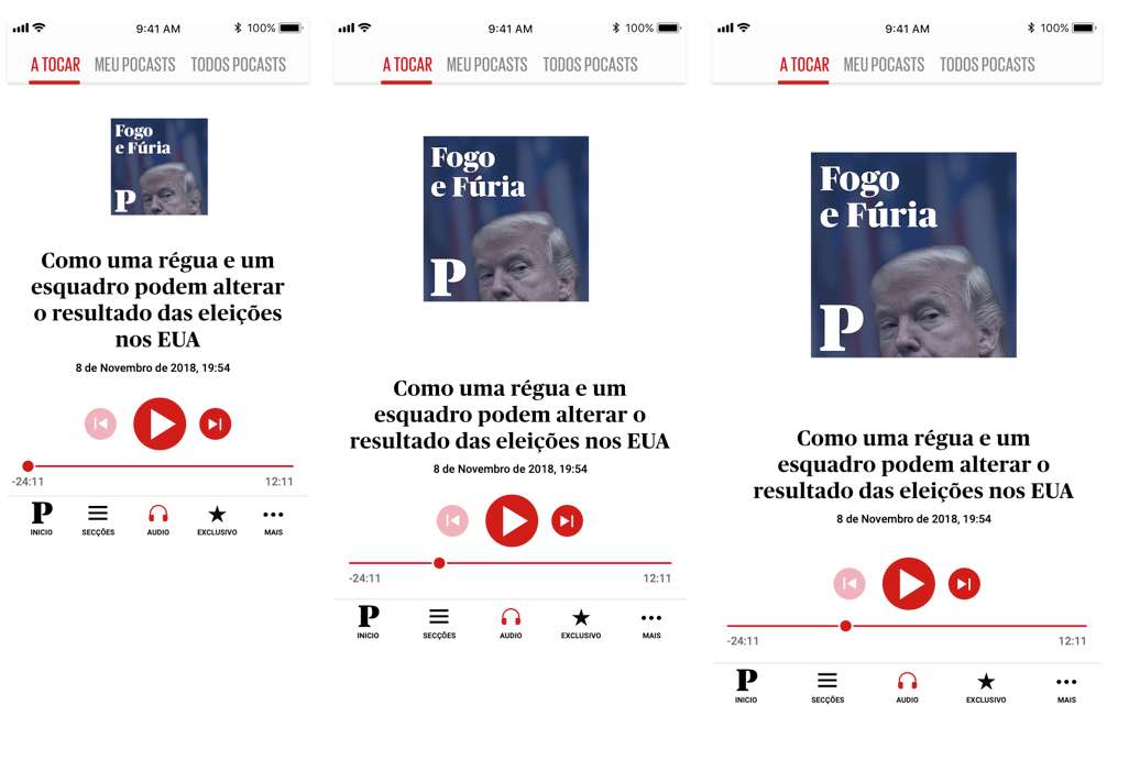
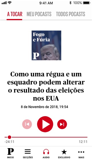
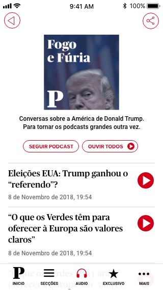
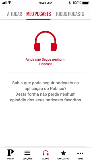
Podcasts
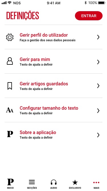
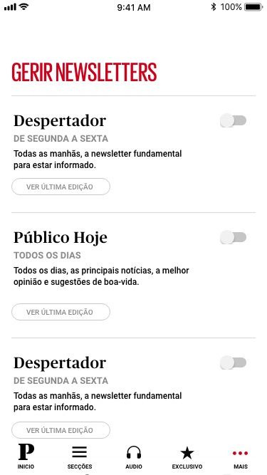
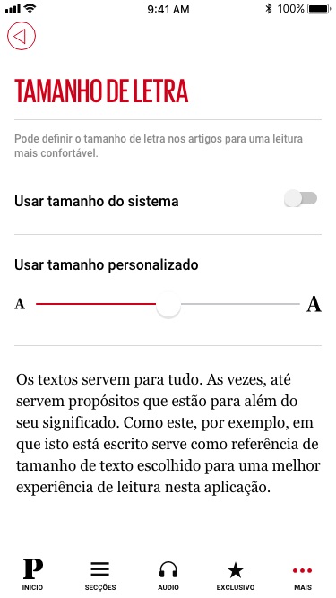
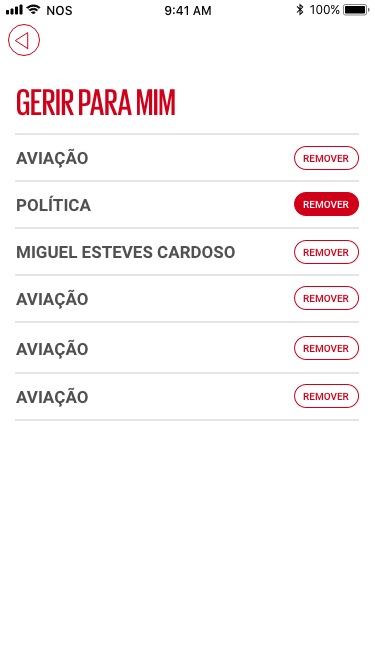
Settings
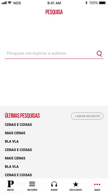
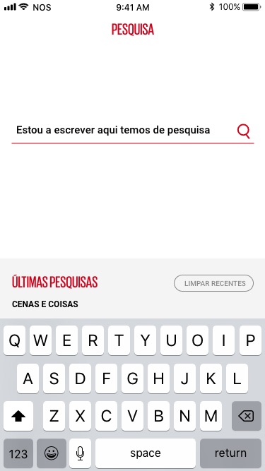
Search